Aradia's Hand
  • Home
  • About
    • Sacred Creation
  • Shop
    • By Use >
      • Newly Arrived!
      • Accessories
      • Decor
      • Jewelry
      • Kids
      • Wedding
      • Ariadne's Threads
      • Ariadne's Threads (Ravelry Store)
    • By Theme >
      • Adorning Beauty
      • Chakra Wellness
      • Crystal Curiousity
      • Divine Spirit
      • Elemental Energy
      • Ever After
      • Gothic Delight
      • Hooked Up
      • In Stitches
      • Literal Madness
      • Perfectly Pigmented
      • Signature Series
      • Starry Guidance
      • Sticks n String
      • Tribal Fusion
      • Utterly Lovely
      • Wee Ones
    • Custom Order Inquiry
  • Blog
  • Portfolio
    • Accessories Gallery
    • Decor Gallery
    • Jewelry Gallery
    • Kids Gallery
    • Wedding Gallery
    • Adorning Beauty Gallery
    • Chakra Wellness Gallery
    • Crystal Curiousity Gallery
    • Divine Spirit Gallery
    • Elemental Energy Gallery
    • Faith Works Gallery
    • Gothic Delight Gallery
    • Hooked Up Gallery
    • In Stitches Gallery
    • Literal Madness Gallery
    • Perfectly Pigmented Gallery
    • Reflecting Brilliance Gallery
    • Starry Guidance Gallery
    • Sticks n String Gallery
    • Utterly Lovely Gallery
    • Wee Ones Gallery
  • Contact

Exploring Ombres & the Variances of Color

3/21/2013

7 Comments

 
Picture
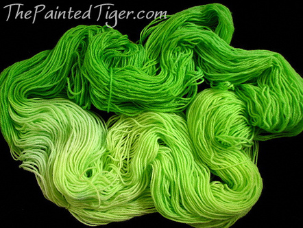
Lime Mojito by The Painted Tiger - Click for Image Source
Ombre, if you're in the fashion and style industry you see this a lot as it becomes popular, fades a bit, then comes back (yes that was a color pun).  But that's not me, I'm a yarnie so terms of fashion only become relevant to me when the involve my love of fibers...

Ombre is a term that many times gets applied to types of yarn, those that may be variegated with all of the colors being of a similar hue and merely differing in shade.  But perhaps I'm getting a bit ahead of myself.  These are all artistic terms that refer to color so let's start there...
Picture
Not the greatest picture...but an accidental ombre I created when bleaching my hair - golden yellow to red to dark brown to black at the very tips
While I'm sure before I could recognize ombre if I saw it, if you asked me to describe it to you I certainly wouldn't have been able to give you a clear answer, gotta love context.  So first off I looked it up this morning because I've been thinking about a pair of house slippers that I think would be simply fabulous in an ombre gray.

Merriam Webster defines an ombre as such:

having colors or tones that shade into each other - used especially of fabrics in which the color is graduated from light to dark.

Picture
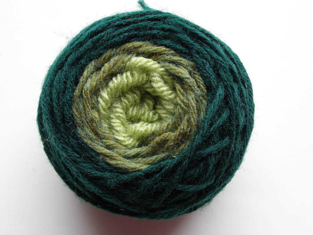
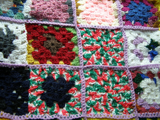
An example of an ombre green made from scrap yarn
Now a brief foray into language for a moment, notice that it's an adjective, so it's being used to describe the quality of something, rather than being something in its own right.  Perhaps even more interesting, which made perfect sense to me being a language geek, that the modern use is French in origin, the verb ombrer means to shade, and of course that comes from the Latin umbra which means shadow.  So while the word sounds a little funny to the ear you can see where it came from.  An aside, this led to me starting to read about shadows in a scientific sense this morning which was also fascinating as an artist.

Meandering back to the point.  Hue essentially is color, the world of science defines it based on light reflected and references that a hue is in lay terms a basic color - like blue, red, green, etc.  Light blue, medium blue, and dark blue would all be of the same hue - eg blue.  Then there are shades - made with the addition of black and tints - made with the addition of white.  But that gets into an artistic defining of hue.  For the artistic a hue is still a color, but one that neither involves a shade or tint.

So in considering creating an ombre pattern within a project you would want to stay within the same hue, and use varying shades.  I do suppose you could use varying tints as well but the whole effect is by using varying degrees of darkness (or lightness) of the same color.  Then all of this had me thinking way back to a painting I did in high school (unfortunately long since destroyed) wherein we did a gridded drawing, painted with acrylics on a large bit of panel canvas in four different styles - true color (to the picture), warm colors, cool colors, and a monochromatic one of any color.  I chose blue and while it's been forever since I did it I can still rather clearly see the varying tints and shades of blue.  A monochromatic pattern mimics the ombre affect to a point.
Picture
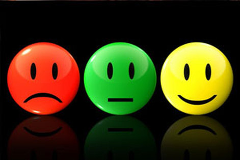
Colors & Emotions - Click Image for Source Credit
Funny how something so simple seeming as color has so much life and variance to it.  Then again color is so integral in our lives in so many other ways.  We use color to describe how we are feeling - red with anger, green with envy, blue when we're sad.  Color can play a major importance in our health, certainly that cold that has you coughing up yellow-white ick isn't as alarming as if it were green, black, or red.  Then there's the proverbial traffic light where red causes us to halt, and green sends us off again with yellowing doing a big of encouraging and discouraging.

They bring us other feelings too, some psychological others less so.  For instance a small room painted a dark color only appears smaller than were it painted a lighter color.  We have colors we are familiar with around certain holidays which help bring those feelings to mind - the red, green, silver, gold, and white of Christmas reminds us of the snow, bells, tinsel, trees, and bright decorations.  Whereas the red, pink, and white of Valentine's Day has us thinking amorous (or anti-amorous) thoughts.

Picture
What colors do you see? Click Image for Source Credit
Color is by no means created equal either.  We all vary slightly in our reaction to colors, though within our individual cultures there are trends in feeling.  (Imagine that a trend in feeling, but trust me there's no doubt, just pay attention and you'll see it.)  What one may call magenta another insists is fuschia.  Still another says it's just pink.  Scientifically speaking where it falls on the light spectrum is what it is, but how we interpret and describe the color and then how we react to it can be entirely different.  Blood red has a bit of a sinister feel to it - but cherry & fire engine red not so much.  But are they so far off from blood red?  Or the bright red of arterial (and highly oxygenated blood) not really.  But they certainly don't inspire the same shudder in some people.

Then there is the tradition within culture, in some such as Chinese, white is associated with death and mourning.  In others its associated with purity and innocence.  Red-haired people in several cultures were regarded as evil - then again it wasn't genetically the norm to see children with that hair color so they were regarded entirely differently.
Picture
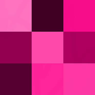
A scrap project made of leftovers of yarn isn't so attractive when the colors are all over the place
In my work, as with any visually-oriented artist, color is very important.  The same garment in a solid color may seem flat and boring, giving it several colors or a progressing pattern of colors can breathe life into a piece.  The "wrong" colors can bring down even the most beautiful design to some less than appealing to look at.  In the healing & spiritual work I do color's importance takes on and whole other importance.  It can be used to heal us and affect us psychologically.  Colors relate, very similarly to the rainbow, to the chakras and certain colors when seen in the aura can hold meanings.  Healing light is often seen as white, pink, or violet.

In the comments below I'd love to hear about your experience with color!  Do you ever notice how it makes you feel?  Do you find yourself gravitating towards certain colors and shying away from some others?  Have you ever seen something you loved but didn't buy because you hated the color?  If you're new to my blog make sure you join the newsletter and check me out on social media so we can connect!
Follow on Bloglovin
Picture
7 Comments
Kelly link
3/21/2013 07:04:28 am

Thanks, this was really interesting! I've been thinking a lot about color lately, too. I find that the older I get, the more attracted I am to bold, bright colors. Blue has always been my favorite, but I find myself drawn to shades of purple now.

It's also one of the frustrations of starting an online business. The colors I use are important to me, and it bothers me that I can't make them look on-screen the way they do in real life.

Reply
Aradia link
3/22/2013 01:19:23 am

Kelly, I'm glad you liked it! An aside: I know with taste as we get older we need flavorful things because our sense of taste dulls a bit. I'm not sure that that relates to colors, but our figurative tastes definitely seem to change as we get older! :) I'm not typically the conservative type but I have a lot of appreciation for some more conservative things more than I used to. Although I don't dislike anything I previously liked.

I think one of the best ways to combat the color issue with business is to use natural light. When we take pictures with incandescent and flourescent lighting (the type of lighting typically used in homes) it casts a bit of a 'pall' over the color. Often yellowing or washing the color out a bit. I can say that most of the colors I shoot are very representative of their actual versions. However lighting very much affects how we perceive color. In lower lighting colors will appear duller, and contrast is also very important, as the bright or darkness of a color appears to change visually relative to the colors around it.

What in particular do you have trouble with? Were these considerations helpful?

Reply
Starlene link
3/22/2013 11:05:54 pm

See, its so funny how we all do define color differently. I personally love the color red. I have painted two of the walls in my office a deep red, almost wine color and the opposite walls a light shade of pink (my own unintentional ombre maybe) I feel that it helps me to feel energized and it is also the love gua of my home. (In feng shui we call section of our homes dedicated to certain aspects of our lives) and I love my business, it is a HUGE part of my life and who I am. Now I wouldn't want my bedroom painted red, I think I wouldn't sleep that well in a red room, because red activates me, motivates me and makes me feel energized. I painted the bedroom a light lavender and I sleep like a baby in it...

I also wanted to mention what you say about the mix matched colors --- and I know this is not the "norm" but then again I am not the normal type of person. I actually really love the mix matched colors, there is something to it, but at the same time there is a method to that madness. For instance my "art gallery" that I also paint in, in my home has dark grape purple walls and I wanted to brighten it up so I bought a beautiful bright green painting of an angel to be the center-point in that room. Typically people wouldn't match grape purple with bright with an ALMOST neon-ish green colored painting, but I get compliments on it all the time. It works, and its really up the the person looking at the particular color/thing to feel that emotion you were speaking of.

In my jewelry making I purposely put colors together to make them stand out, I cant tell you how I do it - it is more of an intuitive thing and sometimes its the ombre sort og way with a graduation from bold to light and sometimes the best pieces are just completely random.

I guess it just goes to show you that beauty is truly in the eye of the beholder!

Much love my sweet Aradia, thanks for sharing this article, it was great! <3 ~~~Starlene

Reply
Aradia link
3/23/2013 02:52:18 am

Thank you dearest for sharing your thoughts! I know a little about Feng Shui but I rarely use the color side of it! I love that you were able to activate certain energy in your home and I think that's a wonderful idea, even if one didn't paint walls but just add other decorations - like your green angel to achieve the presence of the color.

I understand about the color matching together. I have the oddest sense of style and I'd say it's a little gypsy/bohemian-ish. I like to put colors together that one might not be attracted to, or a sort of ombred affect then add something that completely contrasts - like dark muted colors (black, brown) then add a bit of Bright blue (in face my favorite pair of pants are those colors :p!)

And I think what would be interesting to consider would be how color and our reactions work with our astrological & numerological energies too. I could see someone, for example, who has their Sun in a Fire sign liking bold colors, or a statement with what they wear. But if their Moon or Venus were in an Earth sign they might prefer calmer, more muted colors in the areas of their life affected by those placements. Or even the other way around, how we might attract certain colors into our life because we needed their energy to balance out. :D

Reply
Novelty Lighting link
9/30/2013 06:34:54 pm

Excellent. Please keep up the good work for the concise and informative articles. This is more informative than other media, I really like following your blog as the articles are so simple to read..

Reply
Christine Boles link
2/26/2014 02:45:13 pm

I always thought it was interesting that makeup artists teach you to highlight something to bring it out and apply darker shades to things you want to contour or recede~ but in painting, "chiaroscuro" is the exact opposite! On canvas, we paint things dark to pull them forward and paint them light to push them back, visually.
As a teen learning about both arts, this was confusing to me~ till I finally decided that it's because one object is 3D, while the other is flat/2D. The face reacts differently from a painting because it's 3D, while a painting is flat.
But we have found by experience, in our family of artists, that walls painted a SLIGHTLY darker color tend to push back visually more than a light color, making a small room appear bigger than the paler color made it look. Intriguing.
Color and light are rather wild, untamed things....!
Gahh, I'm a huge ColorGeek!

Reply
Aradia link
3/1/2014 04:27:18 am

Thanks Christine for sharing your insight about color and how its used in various art forms! Its always wonderful to learn new and different things about color theory for sure!

Reply

Your comment will be posted after it is approved.


Leave a Reply.

    RSS Feed

    Picture
    Become a Patron!
    Picture
Picture
Connect with me on all your networks!
Picture
Picture
Picture
Picture
Picture
Picture
Picture
Picture

Categories

All
3 Color Journal
4 Color Journal
5 Color Journal
About Me
Acceptance
Accessories
Accomplishments
Acknowledging
Action
AFAB
Alice In Wonderland
Alien
Allan Bloom
#allthethings
Altar Cloths
Alternative
Aluminum Knitting Needles
Amanda Sue Howell
Amigurumi
Animal
Aphrodite
Apocalypse Friday Yarns
Aqua Aura Quartz
Aquarian Elegance
Aquarius
Arachne
Aradia Goseling
Aradia Goseling
Aradia's Hand
Aradia's Hand
Art
Art As A Political Statement
Artfire
Artisan
Artist
Art Journal
Ash
Astro Insights
Astrology
A Study In Colorwork
Athena
Attractive
August
Autism
Autumn
Awareness
Baby Boy Gift
Baby Girl Gift
Baby Shower
Baby Shower Gift
Bags
Bail
Baking
Baking Cookies
Bath
Beach
Beaded
Beaded Kumihimo Necklace
Beauty
Beauty As Wealth
Beekeeper's Quilt
Believe In Yourself
Beltane
Birthday
Black Artist
#Blackartists
Black Friday
#blackgirlmagic
Blending
Blog
Blog Formatting
Blogging
#blpchallenge
Bobbin Lace
Bobbin Lace Jewelry
Bobbin Problems
Bobby Pins
Book
Bookbinding
Book Review
Boutique
Boutonniere
Brand
Breakfast
Brick-a-brack
Briolette
Broken Needle
Broomstick Lace
#brushletterpracticechallenge
Building Relationships
Business
Business Systems
Butterfly Phoenix Coaching
Buttonhole
Buyers
By Any Other Name
Cabaret Cabernet
Cables
Calligraphy
Cancer
Candle
Canvas
Card Holders
Cardmaking
Casapinka
Celtic Tree Month
Celtic Wisdom
Chakra Wellness
Challenge
Change
Changemaker
Charity
Child
Children
Children Of The Underground
Chiron
Chiron Direct
Choices
Clarity
Client
Cloth Napkin
Clutter
Coins
Collaboration
Color
Color Matching
Color Scheme
Comfort
Commitment
Commodities
Communication
Community
Confucius
Consumerism
Consumers
Content
Contest
Cookies
Copywriting
Cosmic Web
Craft
Crafts
Crafty Beats
Craft Your Voice
Crazyideasartwork
Creating
Creating Space
Creative
Creative Process
Creative Writing
Creative Writing Tips
Creativity
Crewel
Critique
Crochet
Crochet Designer
Crochet Dolls
Crochet Pattern
Crocodile Stitch
Cross
Cross Stitch
Cross Stitch Design
Crown Wools
Cthulu
Cuff Down Socks
Cultural Perspective
Curate
Curating
Curation
Custom
Customer
Customers
Custom Order
Custom Orders
Cute
Dances With Wool
Danielle Moore
Daydreams
Day Of The Dead
December
Decisiveness Scoop Shrug
Decor
Decorating
Decorative
Deeper Currents Of Your Life
Delicious
Delisa Carnegie
Demo
Demonstration
Derek Halpern
Design
Designer
Designing Patterns
Design Process
De-stash
Destashing
Details
Devil
Different
Digital Photography
Dionysian Child
Direction
Disaster
Disney Princess
Disney Princess Crochet
Diy
Donation
Done Roving Yarns
Drafting
Dream
Dream Catcher
Dream Journal
Dreams
Drop Spindle
Dye
Earrings
Earth
Echoland
Echoland Bags
Efficiency
Element
Elemental Energy
Embroidery
#EndtheStigma
Energetic Resonance
Equinox
Erica Regelin
Ethereal
Etsy
Ever After
Evernote
Existence
Exploration
Explore
Eyelet Bow
Fabric
Facebook
Failure
Faith Works
Fashion
Feature
February
Feedback
Female-identifying
Femm
Fiber
Fiber And Wire Artisan
Fiber And Wire Artist
Fiber & Wire Artisan
Fiber & Wire Artist
Fine Art
Fiona Stolze
Flag Of Islamic Nation
FLEB
Flutterby Spinning
Focus
Food
For Dummies
Formatting
Fred Rogers
Freeform Crochet
Freelance
Freewriting
Friends
Friend Shawl
Friendship
Frog
Full Moon
Full Moon In Gemini
Full Moon In Leo
Funny
Gaea Lacuna
Garter Rib Baby Hat
Gemini
Gift Giving
Gift Guide
Giveaway
Glass
Goals
Goddess
Goddess Doll
Gothic
Gratitude
Grim Reaper
Grounding
Hair
Halloween
Handfasting
Handknit
Hand Knit
Handmade
Handmade Gift
Handmade Journal
#HandmadeScope
Hawthorn
Healing
Heart Chakra
Heart Monitor
Heaven On Earth Silks
Helen Hunt Jackson
Hiatus
Hibernating
Holiday
Holiday Baking
Home
Home Decor
Hooks
How To
Hue
Hull Street
Humor
I AM Series
Icord
Ideas
Ilene Bag
Illusions
Imagination
Impact
Improvement
Individuality
InfiKNITi Knits
Ink
Innovation
Insomnia
Inspiration
Instagram
Instagram Challenges
International
Interview
In The Shadows
In The Studio
Islamic Nation
Jaala Spiro
January
Jasmine
Jason Strong
Jeb Herrin
Jenny Shih
Jewelry
Journalistic Masterpiece
July
Juno
Juno In Leo
Just For Littles
Juxtaposition Of Neat & Messy
KAL
Kalends
Kelly Diels
Kickstarter
Kids
Killing The Queue
Kill The Queue
Kindness
Kindness Shawl
Kitsch
Knit
Knit Designer
Knitted Snood
Knitting
Knitting Pattern
Knots
Knotwork
Kris Windley
Kumicrazy
Kumihimo
Lace
Lace Knitting
Lace Shawl
Last-minute-gift-giving
Latinx-artist
Laura C George
Laura George
Laura Roeder
Lemonade-recipe
Leo
Libra
Listing Queue
Listings
Litha
Lois Greenfield
Loom Knitting
Lori-Ann Thompson
Love
Love Blossoming
Lucius Annaeus Seneca
Lughnasadh
Lughnassadh
Lunar Eclipse
Lunation
LYS
Macrame
Magic Loop Socks
Make A Difference
Makeover
Making Progress
Mala
Mandala
Marella Clark
Marie Forleo
Marketing
Mars
Mars In Pisces
Mars In Sagittarius
Math
May
Meaning
Meditation
Meditativemessage
Medusa
Melli's Trinkets
Mercury
Mercury Direct
Mercury In Pisces
Mercury In Sagittarius
Mercury In Taurus
Mercury Retrograde
Messy
Metaphysical
Mindfulconnections
Mission
Mom Life
Mompreneur
Monday Motivation
Monster
Moon In Pisces
Morning Blues
Morning Blues Shawl
Moving Forward
MPBD
Mr. Rogers
Mt Craftmore
Mulan
Mural
Muse
Muslim Nation
My Kinda Thing
My Pretty Brown Doll
Naware Danaus
Neat & Tidy
Necklace
Needle
Needlepoint
Needle Tatting
Neptune
Neptune Retrograde
New
New Item
New Listing
New Moon
New Moon In Pisces
New Moon In Sagittarius
New Product
Nib
Ninja
Nosferatu
Not Your Typical Boutonniere
Novelty Yarn
Numbers
Numerology
Nursing Necklace
Nursing Shawl
Nursing Wrap
Oak
Ocean
October
Ombre
One Of A Kind
Ooak
Oombawka Design
Opinion
Organization
Origami
Origami Cranes
Origin Story
Paint
Painter
Paisley Princess
Pallas
Pallas In Taurus
Pancake
Pansexual
Papercrafting
Parfait Recipe
Partnerships
Passion
Patreon
Pattern Design
Patterns
Pattern Scribe
Pattern Writing
Peanut Butter
Pen
Pencil
Pendant
Penmanship
Perception
Periscope
Persistence
Personal
Personal Notes
Phoenixflame Healing Center
Photography
Photo Tutorial
Piggy Bank
Pigscription
Pins
Pisces
Planning
Planning Fallacy
Plarn
Plying
Pocahontas
Politics
Possessions
Possibility
Potential
Praise
Pregnancy
Presence
Price
Price Increase
Pricing
Princess Dolls
Princess Jasmine
Prints
Procraftinating
Product
Productivity
Product Review
Progress
Projects
Project Time
Psychology
Pumpkin Cookies
Purpose
Purse
Queen Of Hearts
Quill
Quilter
Quilting
Quote
Rafflecopter
Random Olive
Ravelry
Reading
Realities Of The Artist
Reality
Real Life Artist
Recipe
Recycled Art
Re-evaluation
Reflection
Representation
Resistance
Resolutions
Responsibility
Retire
Retrograde
Review
Ribbon Rose
Ribbon Roses
Richmond
Rings
Ritual
Robert Musil
Robots
Rocks Reiki Inc98df36726f
Roundnose Pliers
Routine
Rowan
Russian Crochet
Russian Patterns
Sabbat
Sabbat Suggestions
Sagittarius
Sale
Satire
Schedule
Scheduling
Scholarship Contest
Scorpio
Scrumbling
Sea
Seedling Yarn
Selling
Semiprecious6491d7760b
Service
Sevrine Cardigan
Sewing
Sewing Class
Sewing Machine
Shade
Shop
Shopping
Shop Update
Shri Embroidery
Shuttle Tatting
Silk
Silk Art
Simplicity
Sit & Knit
Skeleton
Sketch
Slipped Rib Scarf
Slipped Rib Shawl
Slowing Down
Small Business
Social Media
Social Media Marketer
Social Triggers
Society
Sock Knitting
Socks
Solar Eclipse
Spider
Spinning
Spiritual
Spring
#squadgoals
Squshies
Staci Jordan Shelton
Stained Glass
Starlene Breiter
Statement Necklaces
Status Quo
Stephen West
Stone
Stones
Store
Storenvy
Story
Streamline
Success
Summer
Summer Solstice
Sun
Sun In Aquarius
Sun In Cancer
Sun In Pisces
Support
Susan B Anderson
Suzanne Karnes
Swirls
Symmetry
Tactical Imagination
Target Audience
Target Market
Tarot
Tarot Bag
Taurus
Technique
Temari
Testimonials
Thanksgiving
The Cosmic Web
The Fiber Seed
Third Trimester
This Home Spun Life
Thread
Threading
Tiana
Tie Roses
Time Off
Tint
Toe Up Socks
Toeup Socks
Toe Up Socks Two At A Time
Top Whorl
Training
Translating Russian
Treasury
Troubleshooting
Tunisian Crochet
Tutorial
Twin Tootsees
Twin Tootsees Socks
Twist
Twitter
Unique
Universal Month
Universal Year
Upcycled Art
Updates
Vacation
Values
Vampire
Venus
Venus In Aquarius
Venus In Aries
Venus Retrograde
Vertical Buttonhole
Vesta
Vesta Direct
Video
Virginia
Virtual Assistant
Voice
Wallet
Watercolor
Watercolor Origami
Weaving
Weaving Wonders
Website
Wedding
Wee Ones
West Knits
What's New
What's Up Wednesday
Whats Up Wednesdaysf8799ae71a
Whimsy
Whopski Illusions
William Pollard
Winter
WIP
WIP Wednesday
Wire
Wire Wrapping
With A K Writing
WOC
Woman
Women
Women Of Colo
Womxn
Wood
Wool
Writer
Writing
WUW
Yarn
Yarn Bee
Yarn Bee Diva Sequins
#yarnlovechallenge
Yarn Review
Yemaya
Yolonda Jordan
YouTube
Yule
Zombie

Archives

June 2019
December 2018
January 2018
March 2017
February 2017
December 2016
June 2016
May 2016
March 2016
July 2015
May 2015
April 2015
March 2015
February 2015
January 2015
December 2014
November 2014
October 2014
September 2014
July 2014
June 2014
April 2014
March 2014
February 2014
January 2014
November 2013
October 2013
September 2013
August 2013
July 2013
June 2013
May 2013
April 2013
March 2013
February 2013
January 2013
December 2012
November 2012
October 2012
September 2012
August 2012
July 2012
June 2012
May 2012
May 2011

Powered by Create your own unique website with customizable templates.